Fidelity UXD Internship - Design Team Hire Site
Summer 2015
For the summer intern project, the five interns were tasked with creating a hiring site specifically targetting a younger audience interested in User Experience roles, as Fidelity has a separate UXD team but not a separate design hire site. As a UX Design intern, my main role was establishing the information architecture of the site and creating low/medium fidelity mockups in Axure. I also coordinated between our NJ intern team, the creative director, and the Boston intern team. Final website is here.

Discovery


Concept Design

We decide on creating an website because it is an easily accessed and commonly used platform for job recruiting.

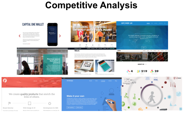
I researched different large companies that were also aquiring or building their own in-house design teams. Companies like Capital One and IBM have already built their own design sites, and these served to give us a better idea of how to merge the sensibilities of corporations and design agencies.
Detailed Design
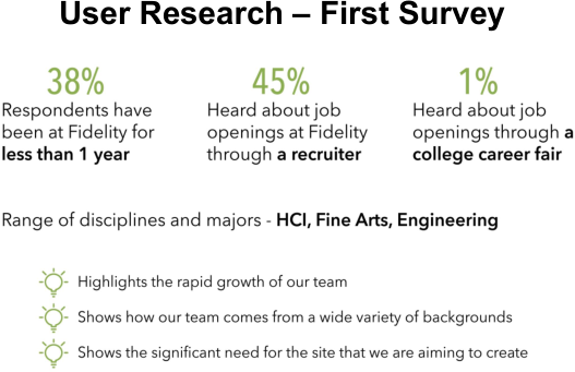
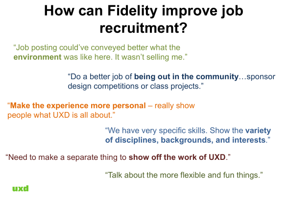
After brainstorming and analyzing our initial survey results, we decided that the aspects of UXD that we wanted to highlight was:
- Resources of a large company
- Culture of a smaller team
- And work having meaningful impact.
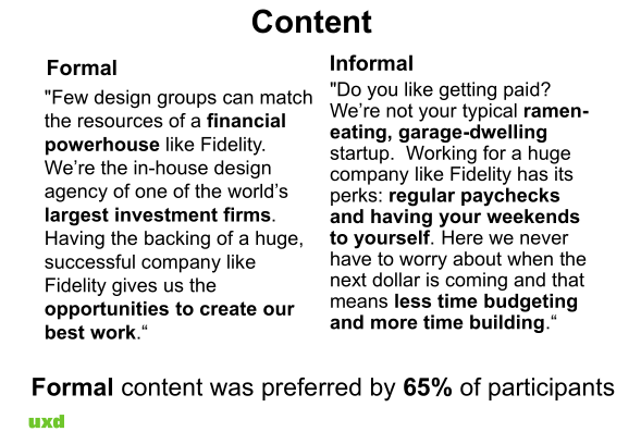
With this in mind, we created four versions of our initial prototype to test: long scrolling page versus information in a row, and formal versus informal copy.
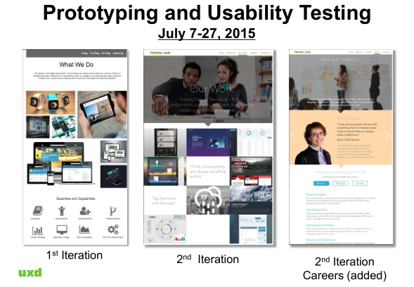
I created the long scrolling prototype on the left. The design included hero images to humanize the copy, and there would be parallax scrolling in implementation.

Usability Testing
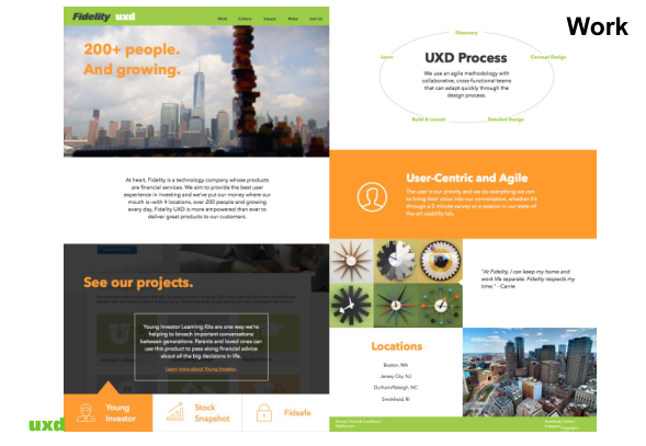
I created the pages Home, Work, Culture, and Join Us for he second prototype after we decided on a making long scrolling site that would be more easily made responsive.

On the Work page, I included sample Fidelity projects, one geared towards Millenials, one from the more innovative Fidelity Labs, and one from Fidelity's core products. Selecting the different project tabs would provide a preview blurb and a link to the main project page.
I organized the page to cover:
- Resources of a large company
- Projects
- Agile and user-centric process
- Work/Home balance
- And various locations.
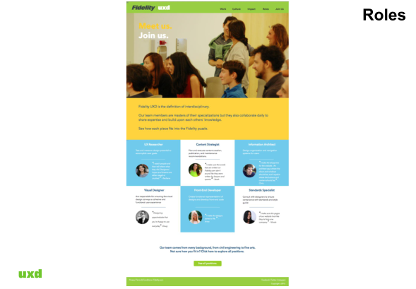
For the culture page, I organized the page to cover:
- Differentation from the stuffy, non-creative stereotypes of financial firms
- Office events
- And open and colorful office space.


The Join Us page ultimately never made it in because of our lack of back-end experience, but we still were thinking about how to improve the existing job system for our project. I mocked up a job listing pages bubbling up the pertinent information of title and location. There were filters based on location and job type, placed on the side so they would always be available.

Boston Team Prototype
Build and Launch
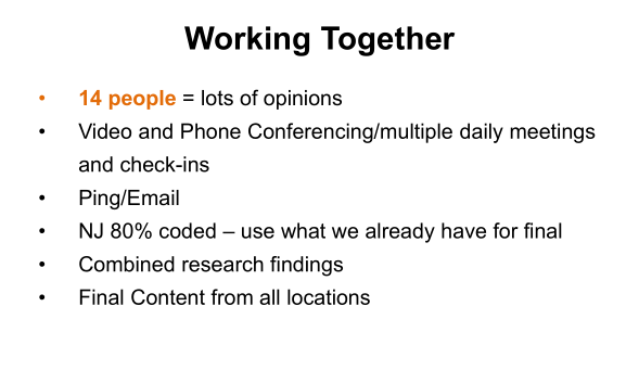
About a week and a half before the deadline, the NJ intern team and the Boston intern team was asked to combine work and come up with one final product. I connected with the Boston team to figure out who was working on which page so that I could assign interns from both teams to work together.
The majority of copy and information architecture from the NJ team and the majority of visual design from the Boston team were used.
Learn

